Introduction
The topic of this vignette is visualization of the hazard of one
event over two time scales. We show the complete set of options for the
method plot, implemented for object of class
'haz2ts' and 'haz2tsLMM'. We assume that the
reader already knows how to estimate the smooth hazard model with two
time scales. Therefore, here we will only discuss the plotting function.
For illustration, we will use the same basic model for the colon cancer
data presented in the vignette Smooth hazards with two time
scales.
The function plot()
The method plot(), for the class 'haz2ts
offers different possibilities to plot the results of the model with two
time scales. The user can choose between plotting the hazard surface
which_plot == "hazard", plotting the standard error surface
which_plot == "SE", plotting cross-sections (also called
“slices”) of the surface at specific values of one of the two time
dimensions which_plot == "slices", and finally, for a model
with covariates’ effects, it is possible to plot only the estimated
coefficients with their confidence intervals (or on the hazard ratios
scale) with which_plot == "covariates".
We will now examine each of these options and their use.
Baseline hazard and log-hazard
The default plot is the hazard surface over the
-plane,
with contour lines in white to mark levels of the hazard. It is obtained
by passing the fitted object, obtained from fit2ts() (hence
of class 'haz2ts', or 'haz2tsLMM') to the
function plot().
plot(mod)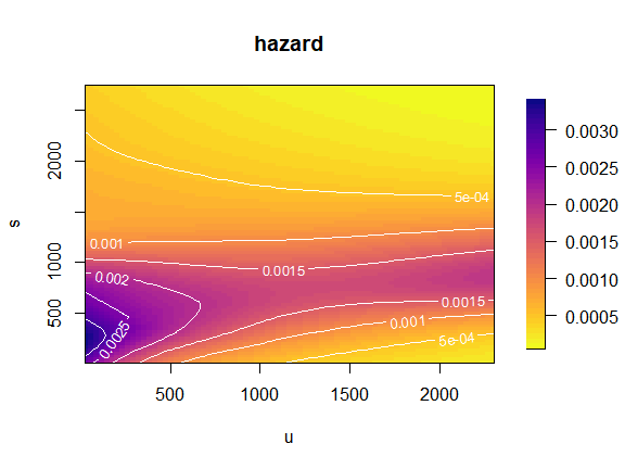
Plot on the -plane
The same plot can be obtained over the
-plan
using a rectangular grid or a grid of parallelograms (in which case it
is not possible to plot contour lines). This is done by modifying the
arguments original and rectangular_grid in the
list of options for the plotting parameters in
plot_options. Additionally, we will here customize the
title of the plots and the label of the axes.
par(mfrow = c(2,1),
    font.main = 1)
plot(mod,
     plot_options = list(
       rectangular_grid = TRUE,               # for grid of rectangles
       original = TRUE,                       # for plot in (t,s)-plane
       main = "Original plane - rectangular grid",
       xlab = "Time since randomization",
       ylab = "Time since recurrence"
     ))
plot(mod,
     plot_options = list(
       rectangular_grid = F,                # for grid of parallelograms
       original = TRUE,                        # for plot in (t,s)-plane
       main = "Original plane - grid of parallelograms",
       xlab = "Time since randomization",
       ylab = "Time since recurrence"
     ))
par(mfrow = c(1,1))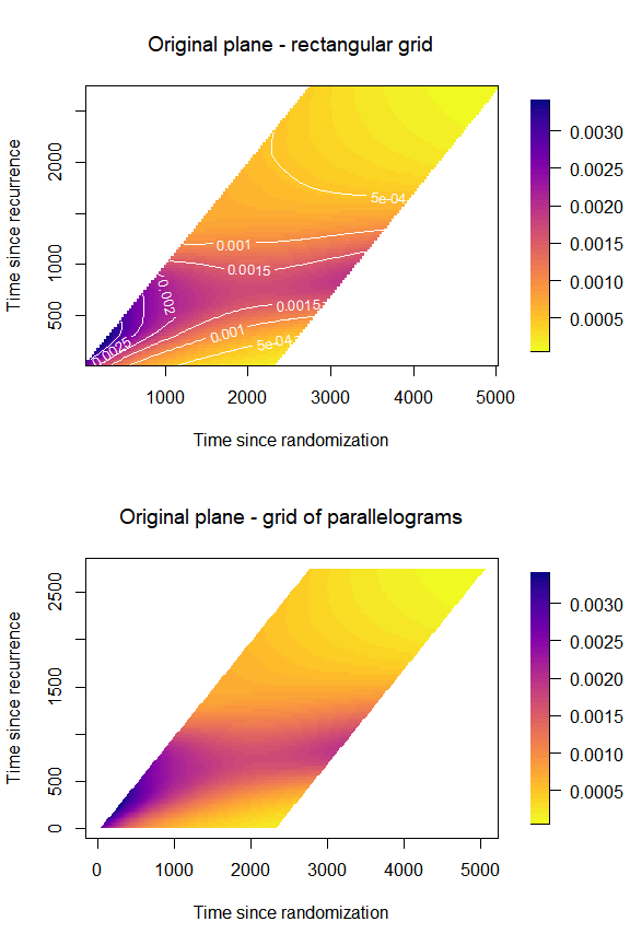
Evaluate the -splines on a finer grid
With the default options, the
-splines
bases used for estimation will be also used to compute the values of the
hazard. If the grid of bins used for binning the data, and to evaluate
the estimating
-splines
bases, is already dense (many small bins), the plot of the estimated
hazard will appear nicely smooth. However, in some cases, larger bins
are used for the original binning of the data and for the estimation of
the model. In such cases it may be worthwhile to evaluate the
-splines
bases on a finer grid of points. The hazard surface will appear much
smoother because it will be interpolated over more points. It is
possible to change the grid for plotting by passing the specification
for a new grid to the argument plot_grid. We show how to do
so by passing the specification for a grid where the bins are 10 days
apart from each other (as opposed to 30). In this case it is a good idea
to increase the number of shades in the color legend too.
plot(mod,
     plot_grid = list(c(umin = 0, umax = 2300, du = 10),
                      c(smin = 0, smax = 2730, du = 10)),
     plot_options = list(n_shades = 100,
                         main = "Denser plotting grid",
                         xlab = "Time at recurrence",
                         ylab = "Time since recurrence"))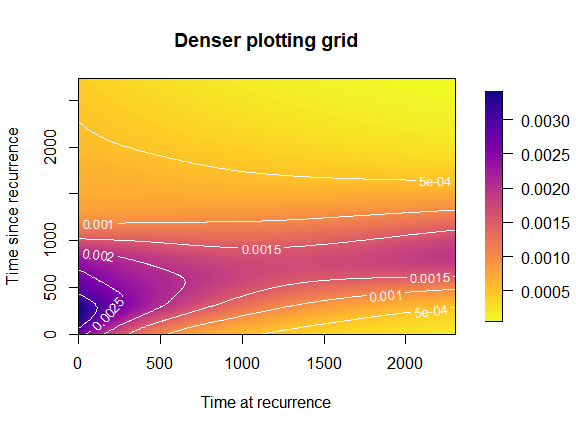
Plot the log-hazard
We can plot the hazard on the log-scale by changing the argument
loghazard = TRUE in plot_options:
par(mfrow = c(2,1),
    font.main = 1)
plot(mod,
     plot_options = list(
       loghazard = TRUE,
       main = "Log-hazard (u,s)",
       xlab = "Time at recurrence",
       ylab = "Time since recurrence"
     ))
plot(mod,
     plot_options = list(
       original = TRUE,
       loghazard = TRUE,
       main = "Log-hazard (t,s)",
       xlab = "Time since randomization",
       ylab = "Time since recurrence"
     ))
par(mfrow = c(1,1))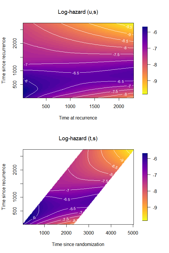
Plot the log10-hazard
Similarly, we can plot the hazard on the log10-scale by changing the
argument log10hazard = TRUE in
plot_options:
par(mfrow = c(2,1),
    font.main = 1)
plot(mod,
     plot_options = list(
       log10hazard = TRUE,
       main = "Log10-hazard (u,s)",
       xlab = "Time at recurrence",
       ylab = "Time since recurrence"
     ))
plot(mod,
     plot_options = list(
       original = TRUE,
       log10hazard = TRUE,
       main = "Log10-hazard (t,s)",
       xlab = "Time since randomization",
       ylab = "Time since recurrence"
     ))
par(mfrow = c(1,1))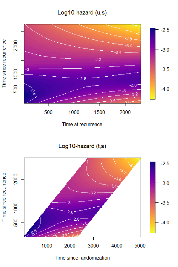
Cut extrapolated hazard
Carollo et al. (2024) discusses the
issue of extrapolated hazard beyond the maximum value observed for the
time scale
.
We can limit the plot of the hazard to those areas where it is not
extrapolated. We do so by changing the values of
cut_extrapolated = TRUE and tmax in
plot_options.
par(mfrow = c(2,1),
    font.main = 1)
plot(mod,
     plot_options = list(cut_extrapolated = TRUE,
                         tmax = 3214,
                         main = "Cut extrapolated hazard",
                         xlab = "Time at recurrence",
                         ylab = "Time since recurrence"))

plot(mod,
     plot_options = list(cut_extrapolated = TRUE,
                         tmax = 3214,
                         original = TRUE,
                         main = "Cut extrapolated hazard",
                         xlab = "Time since randomization",
                         ylab = "Time since recurrence"))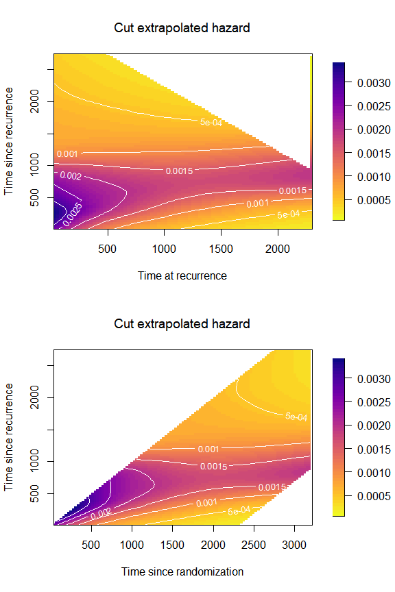
Change color palette and color of the contour lines
Let us try a new color palette and modify the options concerning the contour lines. The palette should be a function of the number of shades, so we need to code one extra line…
mycol <- function(nshades){
  colorspace::sequential_hcl(n = nshades, "Blues 3")
}
plot(mod,
     plot_options = list(col_palette = mycol,
                         main = "New colors",
                         xlab = "Time at recurrence",
                         ylab = "Time since recurrence",
                         contour_col = "pink",
                         contour_nlev = 20))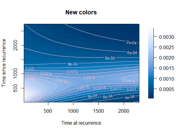
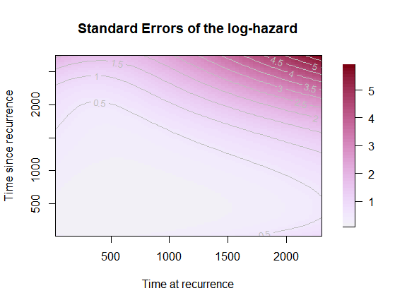
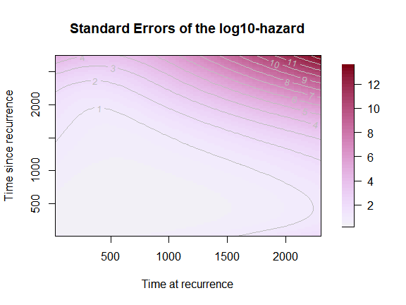
Standard Errors surface
The same options apply for the SE surface, so we will just show how to produce the simplest version of the SE surface plot.
plot(mod,
     which_plot = "SE",
     plot_options = list(main = "Standard Errors of the hazard",
                         xlab = "Time at recurrence",
                         ylab = "Time since recurrence"))

plot(mod,
     which_plot = "SE",
     plot_options = list(
       loghazard = TRUE,
       main = "Standard Errors of the log-hazard",
       xlab = "Time at recurrence",
       ylab = "Time since recurrence"))

plot(mod,
     which_plot = "SE",
     plot_options = list(
       log10hazard = TRUE,
       main = "Standard Errors of the log10-hazard",
       xlab = "Time at recurrence",
       ylab = "Time since recurrence"))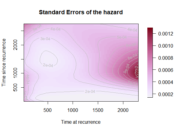
Cross-sections of the hazard
Another very informative representation for the 2d hazard consists of plotting ‘slices’ (or cross-sections) of the two-dimensional hazard as curves over one of the time scales. For example, the 2d hazard surface is plotted as a series of one-dimensional hazard curves over time since recurrence for selected values of time at recurrence . Note: Adding an automated legend to this kind of plot is still not implemented in the package yet, but we can add one manually.
plot(mod,
     which_plot = "slices",
     where_slices = c(30, 60, 90, 180, 365, 1000, 2000),
     direction = "u",
     plot_options = list(main = "Slices of the hazard",
                         xlab = "Time since recurrence",
                         ylab = "Hazard"))
legend("topright",
       legend = c(30, 60, 90, 180, 365, 1000, 2000),
       lty = 1,
       col = grDevices::gray.colors(7))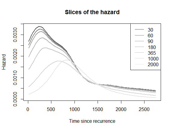
It is also possible to plot one-dimensional hazards over time since
randomization
()
for selected values of time since recurrence
().
The interpretation of these one-dimensional hazards is less clear at the
individual level, but is meaningful at the population level. To obtain
such plot, we specify direction = "s".
plot(mod,
     which_plot = "slices",
     where_slices = c(30, 60, 90, 180, 365, 1000, 2000),
     direction = "s",
     plot_options = list(main = "Slices of the hazard",
                         xlab = "Time since randomization",
                         ylab = "Hazard"))
legend("topright",
       legend = c(30, 60, 90, 180, 365, 1000, 2000),
       lty = 1,
       col = grDevices::gray.colors(7))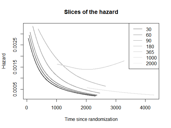
Survival function
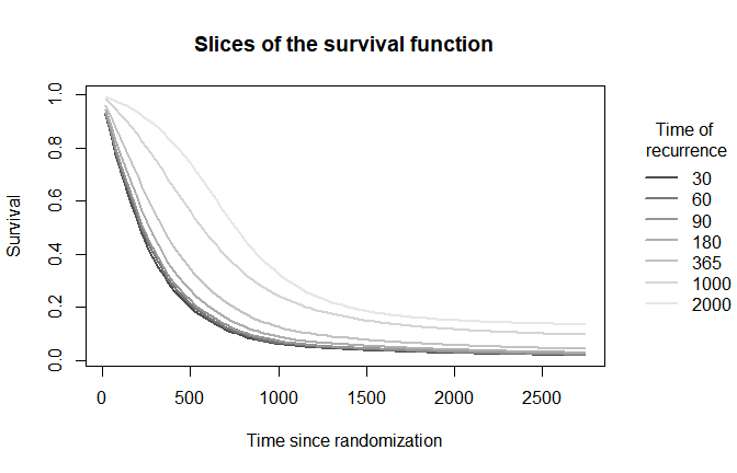
We can represent the survival function as a two-dimensional surface over the -plane (or the -plane), or as cross-sectional one-dimensional curves over , for selected values of .
mycol2 <- function(nshades){
  colorspace::sequential_hcl(n = nshades, "PurpOr")
}
plot(mod,
     which_plot = "survival",
     plot_options = list(col_palette = mycol2,
                         main = "Survival function",
                         xlab = "Time at recurrence",
                         ylab = "Time since recurrence",
                        contour_nlev = 20))

plot(mod,
     which_plot = "survival",
     where_slices = c(30, 60, 90, 180, 365, 1000, 2000),
     direction = "u",
     plot_options = list(
                         surv_slices = TRUE,
                         main = "Slices of the survival function",
                         xlab = "Time since randomization",
                         ylab = "Survival"))
legend(x = 3000, y = .9,
       xpd = TRUE,
       inset = c(-0.3,0),
       legend = c(30, 60, 90, 180, 365, 1000, 2000),
       lty = 1,
       lwd = 2,
       bty = "n",
       title = "Time of\n recurrence",
       col = grDevices::gray.colors(7))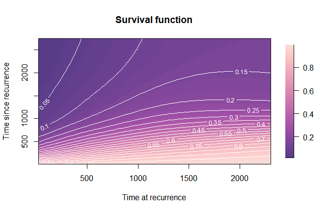
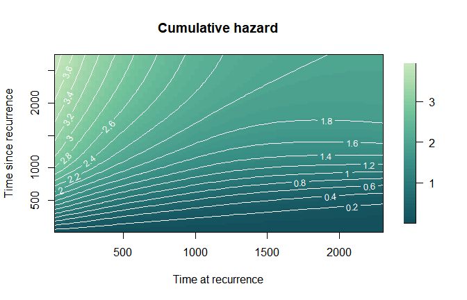
 ### Cumulative
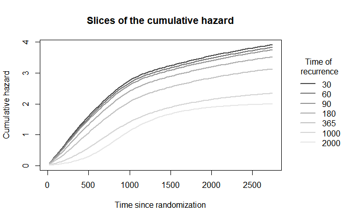
hazard Similarly, we can plot the cumulative hazard either as a surface
or as one-dimensional curves over
 s for selected values of
u.
mycol3 <- function(nshades){
  colorspace::sequential_hcl(n = nshades, "BluGrn")
}
plot(mod,
     which_plot = "cumhaz",
     plot_options = list(col_palette = mycol3,
                         main = "Cumulative hazard",
                         xlab = "Time at recurrence",
                         ylab = "Time since recurrence",
                         contour_nlev = 20))

plot(mod,
     which_plot = "cumhaz",
     where_slices = c(30, 60, 90, 180, 365, 1000, 2000),
     direction = "u",
     plot_options = list(
                         cumhaz_slices = TRUE,
                         main = "Slices of the cumulative hazard",
                         xlab = "Time since randomization",
                         ylab = "Cumulative hazard"))
legend(x = 3000, y = 3.5,
       xpd = TRUE,
       inset = c(-0.3,0),
       legend = c(30, 60, 90, 180, 365, 1000, 2000),
       lty = 1,
       lwd = 2,
       bty = "n",
       title = "Time of\n recurrence",
       col = grDevices::gray.colors(7))